Redesigning
a brand
08.2021 – 02.2022
At the beginning of 2022 the brand “salted.” had a relaunch. The new design mainly included the product packaging, the website and the social media presence, including the brand's tonality.
My responsibilities:
• visual concept of the website and social media
• partly packaging design
• art direction for the rebranding campaign (view “02 Art Direction – Rebranding Shoot”)
from this…
When I started at the brand, there was not really a corporate design, every product looked different and it was hard to create a consistent style. In terms of imagery, there was a lack of dedicated photo campaigns and a clear look.
The brand was aiming for a look that referenced the ocean, was edgy, but also represented the skincare products well. One of the main ingredients in the products is seaweed, so there’s definitely a need to communicate that.
So what was wanted was a clean look that conveyed the feeling of the sea and salty skin, but didn't look too much like the Maldives.
In mid-2021, my former senior art director and I decided to make a proposal for a possible rebranding. The first sketches and ideas quickly turned into concrete plans and a rebranding was already targeted for February 2022. As is often the case with start ups, not everything is ready there, but you are kicking off a process that you would otherwise delay to perfection, only to never implement it.
…to this
What we have renewed:
Packaging:
Products were divided into different categories and named and categorized together with product and branding experts. Colors were reduced to black, white and one new color, sea foam.
A rather standard font became an edgy variable font, GRTSK.
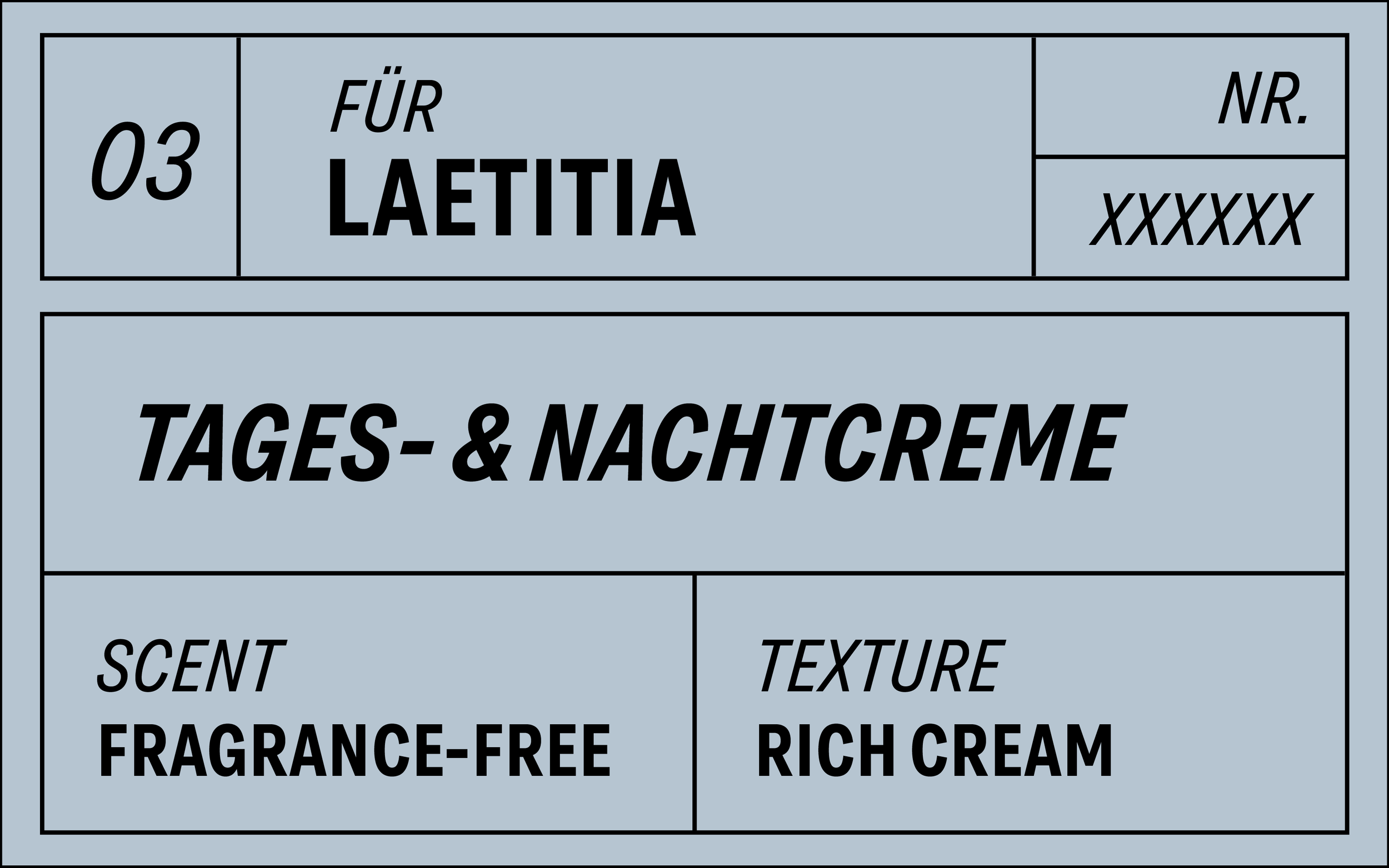
The products with white packaging, cleansers and moisturizers, also received a label that contains all the necessary information of the product. Customers can choose between different fragrances and textures in the webshop and get a product / routine ideal for their skin type.
mock up for a label for customized products
Visual language:
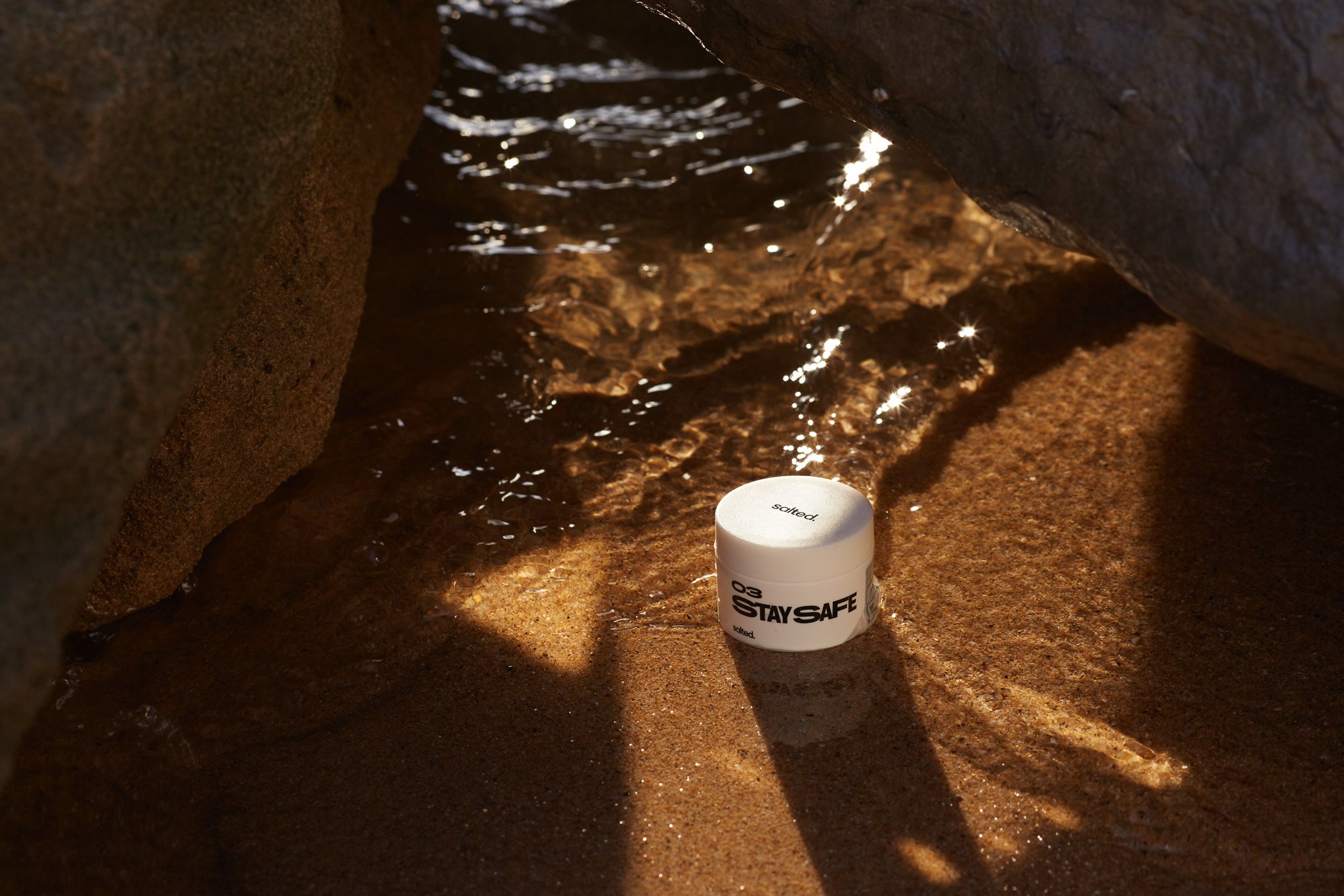
In line with the revamped products, the visual language has been tweaked. There were two rebranding shoots, one in a photo studio in Berlin and one in Portugal, on the beach.
Both shoots I helped conceive and accompany, in Portugal I did the entire art direction and additionally created social media content.
Content from Portugal I shot myself
For more photos check out “Art Direction 02 – Rebranding Shoot” :)


