Productdesign
2021 - 2022
The following four projects show three designs for limited editions that I designed during my time at "salted." and one upgrade I created for the regular packaging.
All artworks, illustrations and product photos shown here were conceived and created by me.
my responsibilities:
visual concept, creation of the artworks & print files, illustration
“Dark Secret”
– Lip Balm
The following product was a limited edition for a Black Friday promotion.
It could be purchased together with a postcard (illustration shown here) during the promotion period and was also accompanied via Instagram.
The theme was secrets that lie behind, or are shared by, nourished lips. and where better for a skincare brand to do that than during a bathroom routine?
The packaging is very simple and should have the look of a – well – black box from the outside. All the information about the product has been printed on the inside of the box. At the time, all salted-packaging contained three wavy lines, which I was happy to quote for this edition. The wave shown is much more minimalistic and is meant to remind us of the cupids-bow and a corner of the lip.


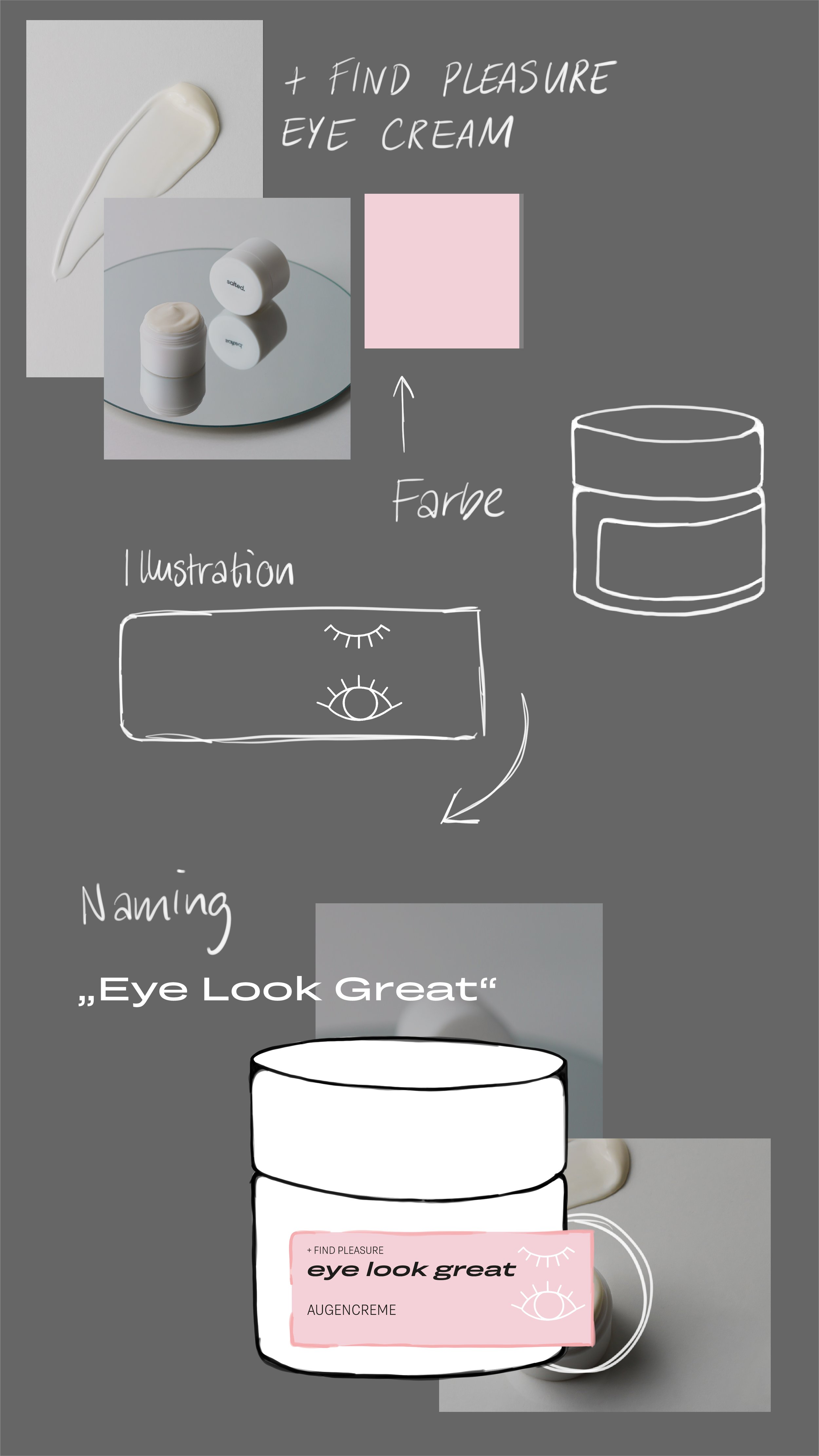
“Eye Look Great”
– Eye Cream
Oct. 2022
This Limited Edition is very special because it was designed together with the community on Instagram. For several days, followers were able to vote on the color and illustration and even suggest names. The final name actually came from a follower and was again selected from a poll within the community.
My task was to accompany the poll on Instagram and to regularly update the community with a completing illustration. I also created the final artwork, which finally went to print as shown here.
All illustrations and photos shown are also by me.


The artboard that informed the community about the different voting rounds.
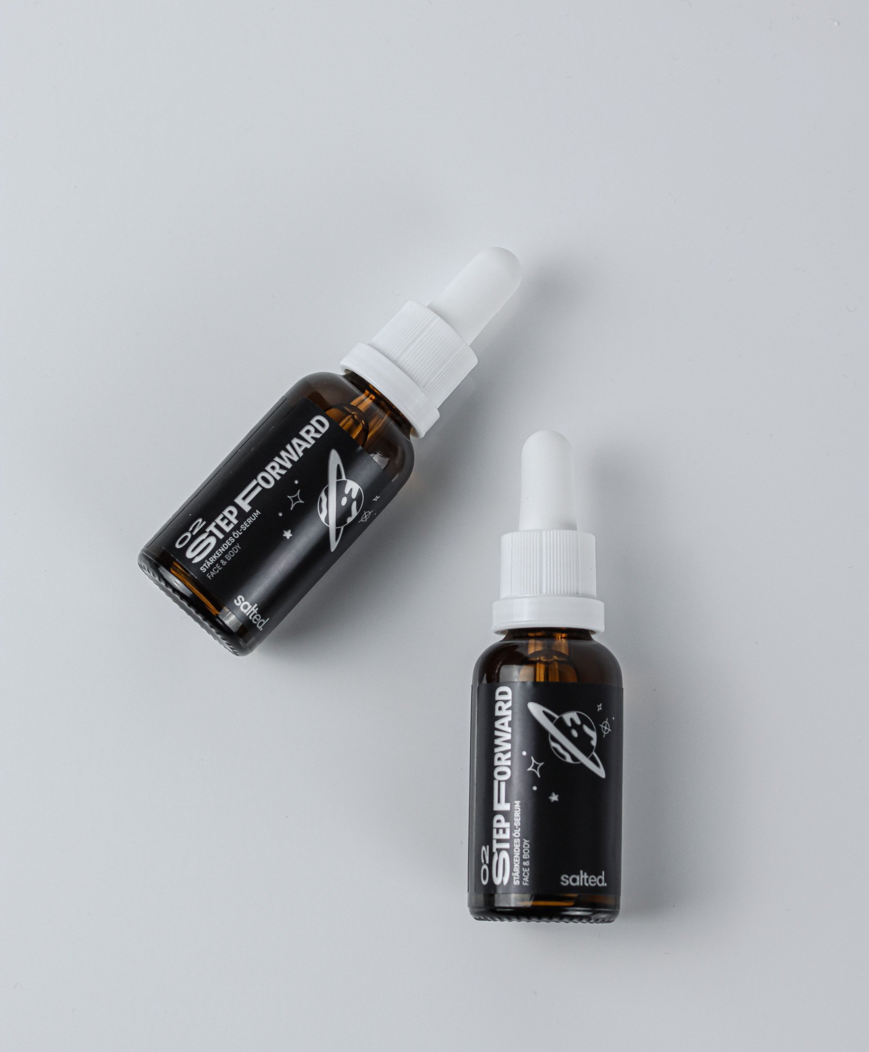
Face & Body Oil
Dec. 2022
The product shown here is a special edition for salted's 3 year anniversary.
At the same time, it represents the stepping stone towards body care products, as it is a multifunctional serum for face and torso.
This product was created in collaboration with the Lead Brand & Communications responsible, as she came up with the whole concept around the communication of the birthday and the Limited Edition.
The packaging is designed in silver metallic and contains a space illustration to illustrate the departure to new "galaxies" (i.e. body products).


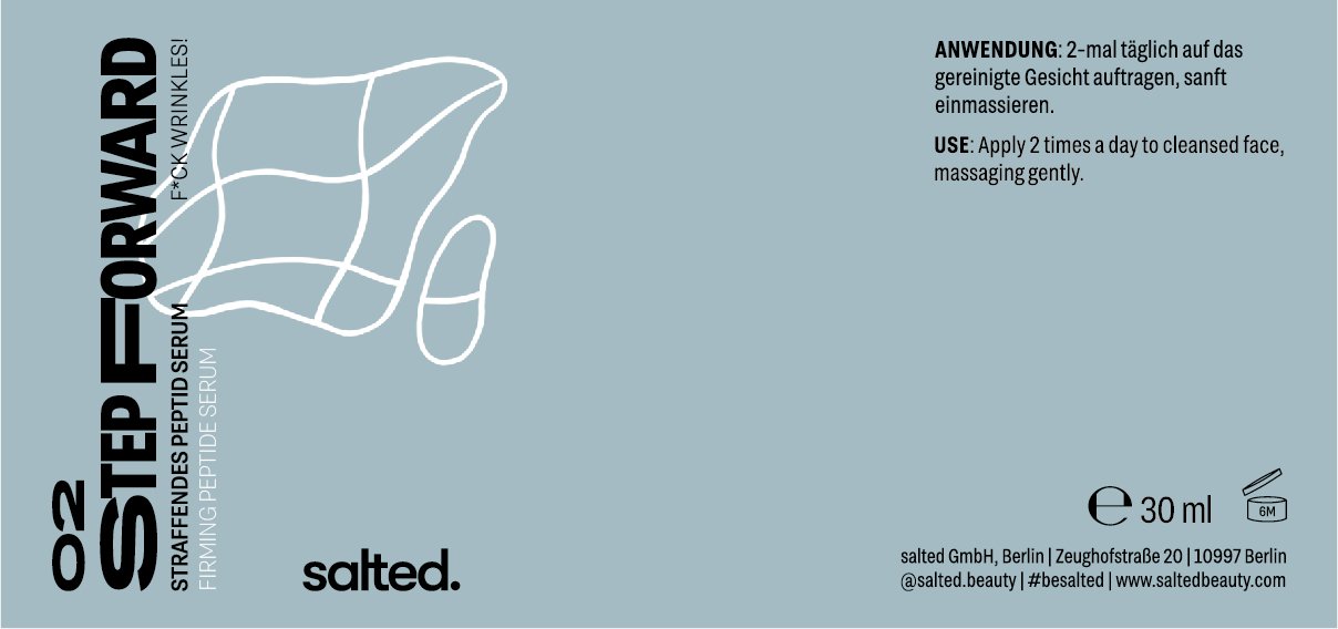
Category-Icons – packaging update
Sept. 2022
To clarify the distinctiveness of the products and their skincare goal, I designed 5 icons to represent the different categories of the products.
These illustrations can be used universally as stand-alone icons, in a kind of legend or as a packaging extension. All of them contain the element of water - an essential point of the brand's USP.
They can be seen on the delicate turquoise shade and are also accompanied by a descriptive claim.


Anti Blemishes
F*CK SPOTS!

Balancing
HI, EVEN SKIN!

Anti Aging
F*CK WRINKLES!

Calming
F*CK IRRITATIONS!
Hydration
HI, HYDRATED SKIN!

Example of a product with one of the above illustations.